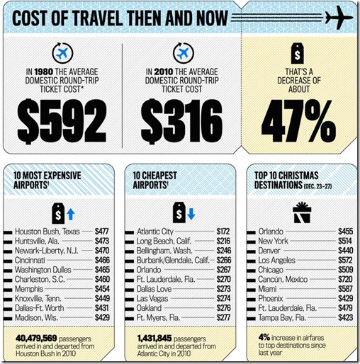
There are several things to note when clicking through to see the full infographic below created by Newsweek magazine about airports:
- It illustrates why deregulation has resulted in cheaper fares, but also problems with airline profitability that has resulted in a decrease in service to many smaller communities. Instead of tweaking the system, we went from one extreme to the other. Deregulation is not a silver bullet.
- Different than many charts of this type graphic artists attempted to truly list airports in about half of the instances but substituted the names of cities in the others to step in the right direction. The names of airports and cities are rarely synonymous.
- Makes one wonder if the list of popular destinations is a list of destinations or just a list of airports. Airports never serve just one community, either outbound or inbound. Their catchment areas always include dozens if not dozens of dozens of distinct community destinations. No one has an airport as a final destination except the airline.
 Infographic by Newsweek magazine
3 comments:
Everything is very open with a precise clarification of the issues.
It was definitely informative. Your site is useful. Many thanks for sharing!
Here is my blog green coffee extract
Thank you for sharing your thoughts. I really appreciate your efforts and
I will be waiting for your further post thanks once again.
Also visit my webpage: shorten url link
Awesome article.
Here is my web site: buy pure garcinia cambogia
Post a Comment